How to design a Squarespace website using dark colors

Last updated December 2019
Ahhhh dark web design.
Fear not, we aren't covering anything sinister or creepy today! No dark web or dark magic here, folks :)
Instead, we are going to do a deep dive into designing a Squarespace website with dark colors. We’re going to talk about what people think about this style, how users interact with them, and whether or not they are a good idea for your business.
Dark website designs can be extremely striking when done right… but they can also be very polarizing.
Because of this, it's super important to consider all aspects of dark web design before choosing this style on your own Squarespace website. I'm here to help you out and make sure that if you do it, you do it right!
Want to build, design and publish your own Squarespace website? Sign up for my free 7 day email course, Launch Your Best Site!
Ready to get started? Great! Let’s take a look.
Related: Why you should have a clean design on your Squarespace website
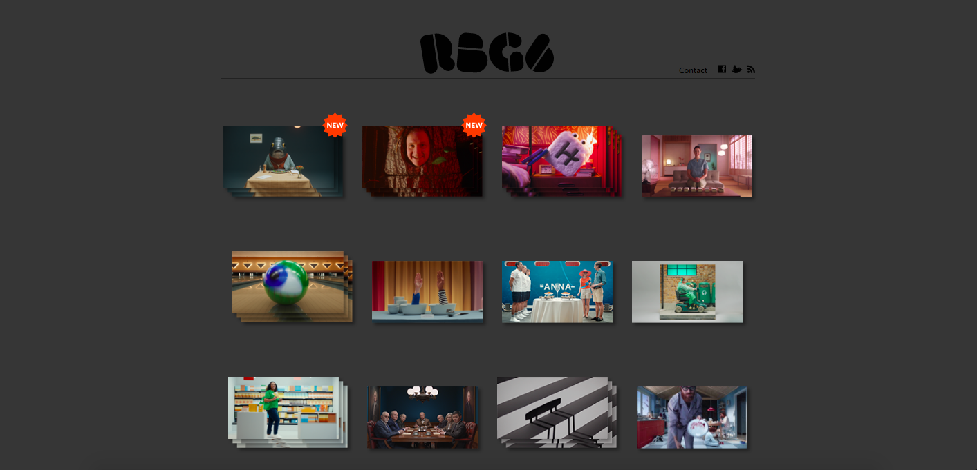
Examples of Squarespace websites with dark design
In case dark web is new to you, it might be helpful to see this color choice in action. Here’s a look at 3 Squarespace sites that are using dark web design.


Why white or light colored backgrounds are normally favoured in web design
Let’s begin by talking about why web designers usually opt for white or light colored backgrounds on their sites.
The reason for this is simple. Generally speaking, it’s easier to read dark text on a white/light background (as opposed to reading light/white text on a dark background).
This is especially true on a screen (like a computer, laptop, tablet or smart phone), which is how most people will be visiting and interacting with your website.
Usability is a major priority in web design - the site must look good but it also needs to function well! You want to make it as easy as possible for people to view and move around your website.
This is why people tend to shy away from using dark colored backgrounds in web design - because it can be more difficult for visitors to read.
Related: How to master color psychology for your brand and website
The importance of readability in dark web design
While everyone has their own preferences about what they do or do not like about design in general (in this case, website design), most visitors will not hang around if they can't even read your website. The harsh contrast between a dark background and light text might be too much for people to easily consume and subconsciously, they might even think that you don't have any consideration for them (and their business).
This doesn't mean that you are restricted to a Scandinavian-influenced "black text on white background" design, but following this best practice will make the user experience much more positive. In addition, this gentler contrast means you won't have to opt for such large text and line spacing, as you would in a darker colour scheme. More info on that here.
Related: Ten Golden Rules of Web Usability : Everything What types of website favour dark design?
What types of websites favour dark web design?
There are certain industries or types of websites that might be more likely to choose a dark coloured website design.
Generally speaking, it’s large corporate brands & businesses who go with dark colored web design, as opposed to smaller websites for solopreneurs, bloggers, or little companies. In part, this is because it requires a lot of skill to design a dark colored website, and can be a big indicator of high-quality or big budget.
For example, fantasy or horror genres often favour a dark colour palette (see here and here), "as do blogs by or for teenagers and gamers, or on subjects like cars, photography, technology or web design", says Robin Houghton.
On the flip side, if you target a younger crowd, they'll likely be used to darker website designs and will have less trouble working their way around your site.
What type of websites should avoid dark colors in their design?
Depending on the type of audience your website is targeting, a dark colored background could be a BAD choice. Some groups of people will find them a big turn off and will be less receptive to the dark colored backgrounds than others.
This is why it’s so important that you keep your audience in mind before choosing a dark color palette for your website’s design.
If your audience/users tend to be older, then they are more likely to have worse eyesight and therefore will find it much more difficult to read a dark coloured site.
Also, some audiences might find a website designed with dark colors too somber and won’t connect with it.
Let’s say you are designing a website for your florist business, early childhood education centre, or vegan restaurant…. those types of businesses will usually go with a lighter, brighter design based on the type of audience they are trying to reach. Makes sense, non?
Color pops with dark web design
A dark background with lighter text can make colors POP more dramatically than if they are used on a lighter background. This is especially true if you’re using neon colors, bright pinks, yellows, and/or metalics.
If this is the look you are going for, you might decide to go with a darker design or color palette.
Choosing the right fonts to go with your dark website design
Think back to our point on usability and readability and how important it is to keep that in mind with the website you’re designing.
A dark design might be a striking choice if your website is very heavy on visuals / images with short captions or lines of text.
By using a clear, sans-serif typeface (click here for examples) in a generous size with good line spacing, your users won't experience as much eyestrain.
Best practice is to avoid serif fonts and to use bigger font sizes on the page (both for headers and overall body text).
Along those lines, it’s a good idea to opt for a taller line height to go along with the font you choose. You can style this in the Site Stylings of your Squarespace website.
Related: My secrets to beautiful Squarespace typography
The importance of white space in dark web design
If you decide to go with a dark web design, you still want to incorporate lots of “white space” on your site!
Whitespace (also called negative space) is the area between the elements on a web page - such as text, images, videos, icons, etc. Whitespace is a MUST because it helps highlight the main content on a web page. Using lots of white space in your web design helps people navigate around your website without any interruptions. If too many elements are cramped close together, then it can be hard for people to focus and find the info they are looking for.
Dark web design is done well when it includes lots of space around various elements on a web page and within the copy.
So if you’re building a Squarespace website, then the spacer content block is about to become your new best friend haha!

Final Thoughts
As a parting reminder, your website is the online version of your business. It’s the real “home base” and is often the first place people will interact with you - online or in real life.
It should be super simple for everyone who visits your website to easily read and navigate around your site - specifically your target audience.
Web design is all about putting presenting your brand and identity to your ideal audience online. It's important to keep accessibility and readability in mind, especially if you are leaning towards a darker website design.
The option isn't off the table but you must move forward with caution and consideration so that visitors to your site are more likely to return and bring their business back.
Now it’s your turn to tell me - does your website have a dark design? Are there any sites you like or frequent that use a darker style? How do you find them? Have you ever switched from a dark design to a lighter one? I’d love to know so leave me a note in the comments below!