Website Reveal for Current Talent
Website Reveal for Current Talent
Recently I had the pleasure of completing a brand new website project for Current Talent, a career coaching and talent management consulting firm based in Vancouver, British Columbia. This project was a real joy to work on because our process was full of collaboration and the founder, Marketta Jokinen, was very receptive and open to my ideas on design, layout and digital marketing features. I loved being able to launch a website from idea to completion, and showcase the exciting business in a new digital platform!
In this blog post I’m going to walk you through the website design and development process from start to finish, tell you about our goals for the project, and also explain the different design features and decisions we made - and why.
Let’s take a look!
Project Background and Description
Current Talent is a career coaching and talent management consulting firm.
This new company is changing the way lawyers and law firms handle employment and success at work in the legal industry. Current Talent and I chose to work together on the design and launch of a new website and online platform that would serve existing clients, and also attract and grow business.
We were starting totally from scratch on this website (meaning it wasn’t a redesign project) which I love because it’s so much FUN working with a clean slate and setting up the technology on the back end!
With this new website, we had to speak to several distinct audiences and present the various services in a way that was easy to understand and straightforward. Since Current Talent is a services based business, the website needed to introduce existing and prospective clients to the founder, explain the three main services areas, and promote the resources & in-person and online workshops.
The website also had to reflect a professional aesthetic and grow the business’ online platform.
Current Talent had had great success working with clients during the initial launch of the business, but now that the real launch was happening, it was time to promote the offerings and create a position and presence within the legal industry.
Project Goals and Objectives
There were four primary goals for the new website:
- Develop an online presence for the business
- Launch a new website that serves both new and existing clients
- Present service offerings to 3 distinct audiences
- Showcase online resources and webinars
Interest for Current Talent’s services was growing, both locally and in different markets around the country, thanks to the founder Marketta Jokinen’s strong network and reputation in the industry. Prior to having a website, Marketta relied on her LinkedIn profile and it was time for an upgrade. The goal was to attract casual followers (whether on social media or LinkedIn) and direct them to the new website, where the formal process of working together could be introduced and initiated.
Creative Strategy
We were starting from scratch with Current Talent on a brand new website so it’s no surprise we chose Squarespace (here’s why!). We went with the Bedford template and made some key customizations.
Before the website build began, Marketta from Current Talent filled out my Client Questionnaire so that I had a better understanding of the business, how to position the company online, what aesthetic we were going for, etc. This is a mandatory step in my Design & Development process and really helps guide the website project. It’s a fun way to get ideas down on paper and brainstorm the best ways to present a lot of information to the online audiences.
We knew we wanted a website that had a heavy focus on cohesive visual and text content. We made use of full-width banner images with text overlay across the site and incorporated a mix of index and regular pages. We had beautiful photography that was taken for the website (and other marketing materials) that we used along with some paid stock images.
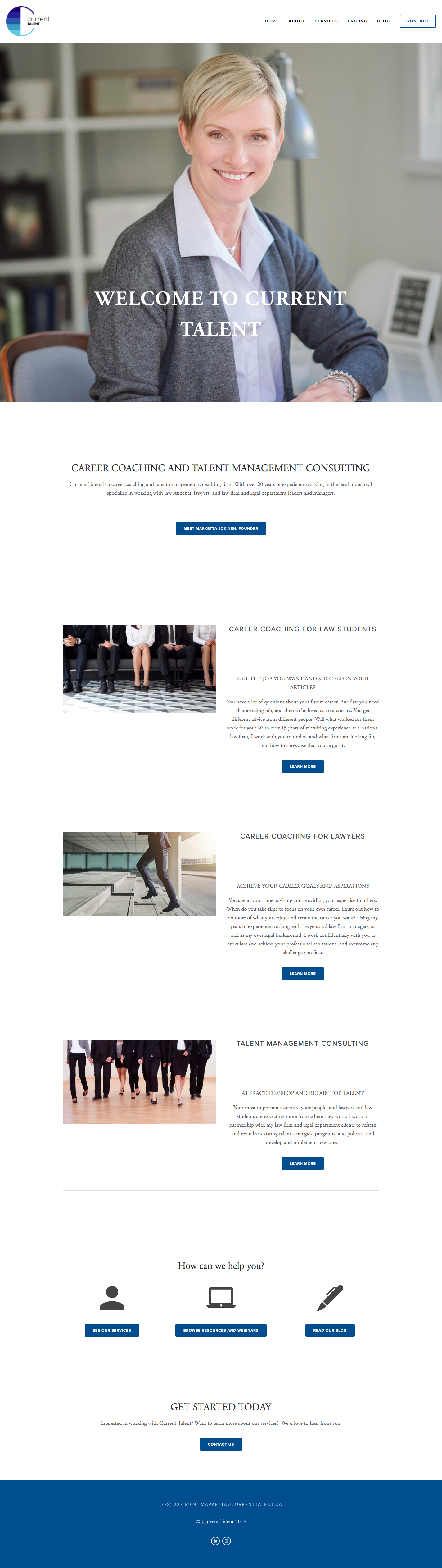
A look at the Current Talent home page
Since the home page is arguably the most important page of any website, we designed it in a strategic way that presented the various services offerings right off the bat. We created separate sections for the two branches of career coaching (law students and lawyers) as well as talent management. Next up we created 3 clear call to action (CTA) sections: services, resources and webinars, and blog. This was followed by an invitation to visit the Contact page since that’s how we want visitors to the website to convert. We designed the home page with mobile in mind, which meant formatting the text and images in the services sections in a clear and ordered way that displays properly in a stacked position on smaller screens. Thanks to the Client Questionnaire and content strategy discussions, we knew what information was the most important to present right off the bat as well as what actions we wanted people to take, and built the home page around that.
We also designed a very straightforward and clear navigation. Best practice is to always have a navigation that is simple, self-evident (no explanation or learning curve required), and consistent across all pages of the website. As you can see we adhered to this simple structure with a large amount of white space to create a good visual hierarchy. The menu is also clearly separate from the other content of the web pages as you move around the site.
There was a lot of content that would go under the Services section and we took the time to set this up in an intuitive way. When users click on the Services menu item, they are taken to a sort of "services intro" page that clearly outlines the three main service areas. There are then separate pages for each service area (career coaching for students, career coaching for lawyers, and legal talent management) as well as the Resources & Webinar and Testimonials pages.
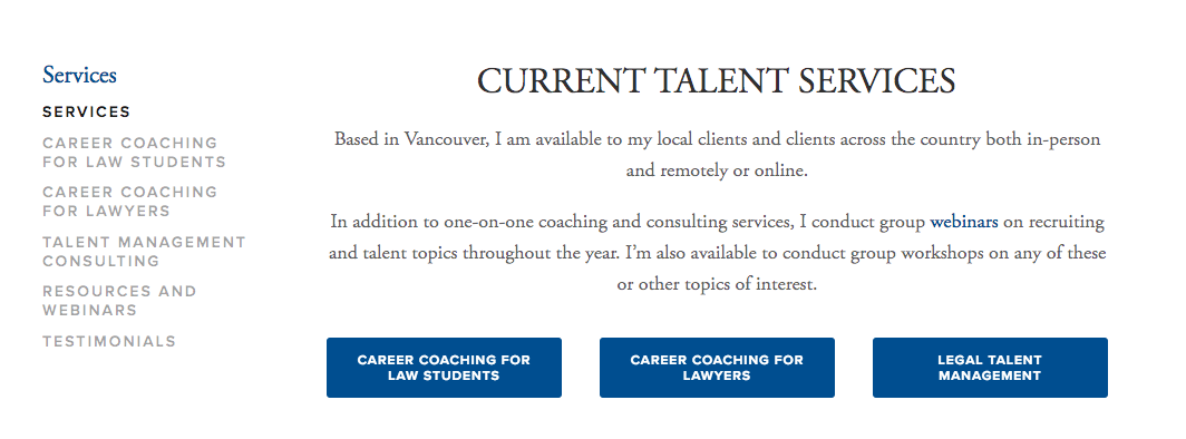
A look at the Services section of the Current Talent website
Setting up a blog was another priority, and we created a blog page with quick links to content (centered around 3 categories) and included a search bar. This way readers can easily find the content they are looking for as the blog grows with more and more posts. Let's not forget that adding a blog to Current Talent’s site will also have extra SEO benefits and since there will be more content for search engines to index, the website will be presented to more people online!

Current Talent blog page view before the post feed
Finally, we linked to Current Talent’s social media accounts (LinkedIn and Instagram) and also included contact information for easy access in the footer content which displays across the entire website.
Branding
Logo & favicon : Logo was designed by Sasha Mills and we used the element in the site’s navigation and as the favicon. Since we used the Bedford template, the logo displays very nicely and really pops thanks to all the whitespace.

Fonts : We used both Proxima Nova and Adobe Garamond Pro fonts across the site.
Related: My secrets to beautiful Squarespace typography (bonus font guide included)
Colours : We pulled the shade of blue from the logo and balanced those with the colours picked up in the photography across the site. We kept the colour palette simple and in-line, which resulted in black, white, blue and grey.
Related: How to master colour psychology for your brand and website

Current Talent Colour Palette
Images and graphics : As mentioned, the website makes use of original high-resolution photography and some paid stock images. We also used several icons (for example, on the home page) and media graphics.
Success Metrics and Results
Keeping in mind the goals mentioned above, let's take a look at the results after the website redesign process.
Develop an online presence for the business : We customized the Squarespace site so that it reflected Current Talent’s brand and spoke to the various audiences online. We established an aesthetic that can be used across various platforms (website, social media, marketing materials, webinars, etc.) and positioned the content in a way that is clear, intentional and a mix of visual and text.
Serve new and existing clients : The new Current Talent website introduces the various offerings to new clients but also clarifies the services and resources to current clients. We emphasized ways that Current Talent can serve clients both in person and online.
Services for 3 distinct audiences : The home page gives a good intro to the 3 main service areas and then each section links to a page where more information is presented. By keeping these service areas separate, we make sure that people can easily identify which group they fit in and how Current Talent can serve them.
Online resources and webinars : There’s more to Current Talent than one-on-one coaching and consulting, which is why we wanted to present those in-person and online resources separately. Visitors to the website can easily see what’s coming up and can join the events via the site.
I also want to point out that since this is a brand new website, we have seen a steady increase in website traffic and referrals come from a variety of sources. Although most visitors view the website from laptops/desktops, there is still a significant percentage of people who visit the site on mobile devices. This is just another reason why Squarespace is so great, because every website is automatically mobile responsive and displays the content beautifully across devices of all sizes. In the future, we expect to see even more website traffic and Current Talent might also add email marketing as a new feature. If you’re thinking about including email marketing and having a newsletter as part of your new/existing website, you can read my thoughts here!
Final Thoughts
I had so much fun working on this brand new website project because we were very clear on our goals from the start and ended up with a site that is beautifully designed, fully functional and intentionally laid out. The finished product is visual, cohesive, targeted and thoughtful, and it also does a great job of speaking directly to existing and potential clients in several different areas. I am thrilled to add Current Talent’s website to my portfolio so head on over to the site if you haven't already!
Now it’s your turn to tell me, what are your thoughts on the new Current Talent website? Are there any features that jumped out at you? Do you have any questions about the design process or the choices we made? Any thoughts on the layout? I'd love to know so leave me a note in the comments below!
LAUNCH YOUR BEST SITE - FREE ECOURSE
Interested in learning more about what it takes to get a website up and running? Sign up for my free 7 day e-course!

